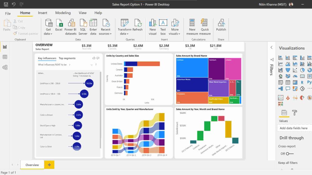
In today’s data-driven world, businesses rely heavily on Key Performance Indicators (KPIs) to track their performance and make informed decisions. Microsoft Power BI is a powerful tool that allows users to create visually appealing and insightful KPI dashboards. In this article, we will walk you through a step-by-step tutorial to create a simple yet beautiful KPI visual in Power BI.
Power BI is a business analytics service by Microsoft that provides interactive visualizations and business intelligence capabilities with an interface simple enough for end users to create their own reports and dashboards in Power BI. It is a part of the Microsoft Power Platform, which also includes Power Apps and Power Automate.
Before we dive into the tutorial, let’s understand the importance of KPIs in business intelligence. KPIs are measurable values that demonstrate how effectively a company is achieving key business objectives. Organizations use KPIs at multiple levels to evaluate their success at reaching targets. High-level KPIs may focus on the overall performance of the enterprise, while low-level KPIs may focus on processes in departments such as sales, marketing, HR, support, and others.
Step-by-Step Tutorial
Let’s get started with the tutorial. Follow these steps to create a simple yet beautiful KPI visual in Power BI:
- Open Power BI Desktop: If you haven’t already, download and install Power BI Desktop from the official Microsoft website. Open the application and create a new report.
- Import Data: Click on the ‘Get Data’ button on the Home tab and select the data source you want to use. Power BI supports a wide range of data sources, including Excel, SQL Server, and online services like Google Analytics.
- Load Data: After selecting the data source, load the data into Power BI. You can preview the data and make any necessary transformations before loading it.
- Create a KPI Visual: Once the data is loaded, go to the Visualizations pane and select the KPI visual. Drag and drop the relevant fields into the ‘Indicator’, ‘Trend axis’, and ‘Target goals’ sections of the KPI visual.
- Customize the KPI Visual: Customize the KPI visual by changing the colors, fonts, and other formatting options to match your preferences. You can also add additional visuals like charts and tables to provide more context to your KPI.
- Publish the Report: Once satisfied with the KPI visual, you can publish the report to the Power BI service. You can share the report with your team and embed it in your organization’s intranet or website.
For a detailed step-by-step guide, you can refer to the tutorial on Medium: Creating a Simple Yet Beautiful KPI in Power BI. For more resources and tutorials, check out the Power BI Masterclass on linktr.ee/powerbi.masterclass.
The Power of Data Visualization
Data visualization is a crucial aspect of business intelligence. It helps transform complex data into clear, actionable insights through visual storytelling and advanced analytics. According to a report by Inc42, the data visualization market was valued at $5.9 billion in 2021 and is projected to reach $10.2 billion by 2026. This growth is driven by the increasing adoption of data analytics, demand for real-time insights, and focus on data democratization.
Microsoft Power BI is a leading player in the data visualization market, competing with other tools like Tableau, QlikView, and Looker. Power BI’s integration with AI and machine learning (ML) technologies further enhances its capabilities, allowing users to leverage advanced analytics for better decision-making.
One of the key trends in the data visualization market is the shift from traditional reporting to proactive, AI-driven insights. With advancements in AI and ML, tools like Power BI can now provide real-time data analysis, performance tracking, and customer insights. This shift is transforming how businesses approach data analysis and decision-making.
Ethical Considerations in Data Visualization
While data visualization offers numerous benefits, it also comes with ethical considerations. Data privacy and bias in data and algorithms are significant concerns. Organizations must ensure that their data collection and usage practices comply with data privacy regulations like GDPR and CCPA. Additionally, they must address any biases in their data and algorithms to ensure fair and accurate insights.
In conclusion, creating a simple yet beautiful KPI visual in Power BI is a straightforward process that can significantly enhance your business intelligence capabilities. By leveraging the power of data visualization, you can transform complex data into clear, actionable insights and drive better decision-making in your organization.
Ready to Transform Your Hotel Experience? Schedule a free demo today
Explore Textify’s AI membership
Explore latest trends with NewsGenie
