
Climate change advocacy requires data-driven insights to influence policymakers, engage the public, and drive action. Whether it’s presenting evidence on rising carbon emissions, deforestation rates, or renewable energy adoption, having access to relevant and credible data is crucial. This is where Textify Analytics plays a key role, helping campaigners and policymakers make informed decisions with instant access to thousands of charts. In this guide, we’ll explore how Textify Analytics has helped build a policy and advocacy campaign for climate action, offering real-time examples of its capabilities.
Step 1: Identifying Key Climate Issues
Before launching an advocacy campaign, it’s important to define the specific climate-related issues to address. Some critical focus areas include:
- Rising Global Temperatures – Tracking historical temperature changes and future projections.
- Deforestation Trends – Monitoring the impact of deforestation on carbon emissions.
- Renewable Energy Adoption – Evaluating shifts from fossil fuels to solar, wind, and hydropower.
- Air Quality and Pollution – Analyzing health impacts due to increased CO₂ levels.
How Textify Analytics Helps:
- Provides instant access to credible datasets from scientific and governmental sources.
- Allows users to search for specific environmental topics and generate data-driven insights.
- Offers real-time trend analysis to track environmental changes over time.
Step 2: Generating Charts at a Click of a Button
A powerful feature of Textify Analytics is its ability to instantly generate relevant charts based on search queries. Instead of manually compiling data from multiple sources, users can retrieve pre-built charts with a single click.
Real-Time Example:
An environmental advocacy group preparing a report on global carbon emissions used Textify Analytics to:
- Search for “global carbon emissions over the last 50 years.”
- Retrieve a curated list of charts showing historical CO₂ emissions by region.
- Download high-quality visualizations for integration into policy briefs and presentations.
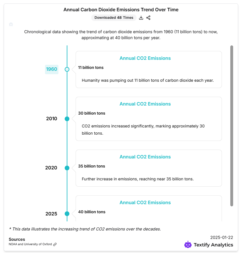
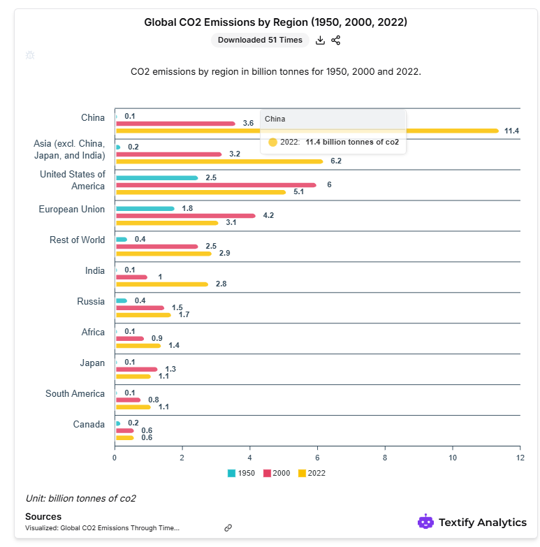
This saved hours of manual research and ensured that their advocacy materials were backed by credible, up-to-date data.
Step 3: Presenting Data to Influence Policy
Once the data has been collected and visualized, the next step is presenting the insights effectively to policymakers, NGOs, and stakeholders.
How Textify Analytics Helps:
- Allows easy comparison of environmental trends across different regions and timeframes.
- Provides interactive dashboards for real-time data presentations.
Real-Time Example:
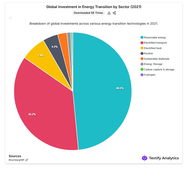
During the 2023 UN Climate Conference, a coalition of researchers used Textify Analytics to present:
- Projected sea level rises by 2050, backed by real-time satellite data.
- Comparative analysis of renewable energy policies in the EU vs. the US.
- Visual evidence of air pollution impacts in urban cities, influencing policy discussions.
These data-backed presentations led to increased funding commitments for sustainable energy projects.
Step 4: Using Data to Mobilize Public Awareness
Beyond influencing policymakers, climate advocacy also relies on public engagement. Social media campaigns, news reports, and community initiatives benefit from data-driven storytelling.
How Textify Analytics Helps:
- Generates shareable infographics for social media campaigns.
- Provides downloadable charts to support journalism and public awareness.
- Tracks public sentiment trends related to climate issues.
Real-Time Example:
A nonprofit focused on plastic pollution awareness used Textify Analytics to:
- Generate a report on global plastic waste trends.
- Create engaging infographics for social media to highlight key statistics.
- Mobilize grassroots movements by showcasing plastic consumption per capita in different countries.
This led to increased public support and policy discussions on reducing single-use plastics.
Step 5: Measuring the Impact of Advocacy Efforts
To assess the success of a policy and advocacy campaign, it’s crucial to measure engagement metrics, policy changes, and funding allocations.
How Textify Analytics Helps:
- Tracks policy changes by analyzing legislative trends over time.
- Monitors engagement data to see how stakeholders respond to advocacy efforts.
- Provides comparative insights to evaluate campaign effectiveness.
Real-Time Example:
A climate action group advocating for clean energy subsidies used Textify Analytics to:
- Compare government investment in renewables vs. fossil fuels over the last decade.
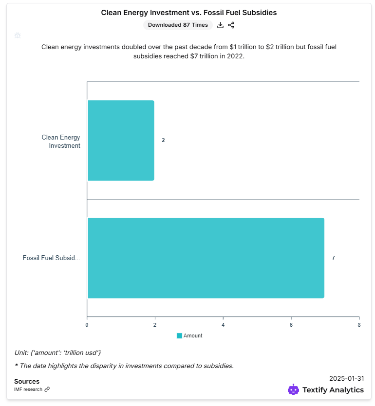
- Analyze the impact of climate laws passed in different countries.
- Assess public sentiment shifts after major environmental campaigns.
By quantifying the success of their advocacy, they were able to refine their strategies for future campaigns.
Final Thoughts
Textify Analytics is a game-changing tool for climate action advocacy, offering instant access to relevant data, automated chart generation, and in-depth policy analysis. By streamlining research efforts, providing real-time insights, and facilitating data-driven storytelling, it empowers activists, policymakers, and organizations to drive impactful change.
Whether you’re building a climate policy report, launching an advocacy campaign, or engaging the public with data, Textify Analytics provides the tools needed to make informed, persuasive, and evidence-based decisions.
Explore Textify Analytics today at https://analytics.textify.ai/ and take your climate advocacy to the next level!
Explore Textify’s AI membership
Be updated with Textify News
Need a Chart? Explore the world’s largest Charts database