
Creating an insightful and data-driven presentation for Public Health Studies requires access to accurate statistics, trend analysis, and compelling visuals. However, gathering and organizing this data manually can be overwhelming. Textify Analytics simplifies the process by offering instant access to relevant charts, real-time insights, and automated data visualizations with just a click of a button.
In this guide, I’ll walk through how I used Textify Analytics to efficiently build a Public Health Studies presentation, ensuring it was both informative and visually impactful.
Step 1: Identifying Key Public Health Topics
A strong public health presentation should focus on relevant health trends, disease prevalence, policy impacts, and community health statistics. The challenge is finding credible data sources and structuring them effectively.
How Textify Analytics Helped:
- Provided access to thousands of public health datasets from credible institutions (WHO, CDC, etc.).
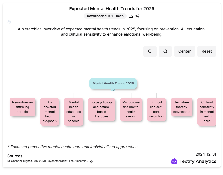
- Allowed me to search for key topics like “infectious disease trends” or “mental health statistics” to find relevant data instantly.
- Suggested pre-built charts and reports, saving time on manual research.
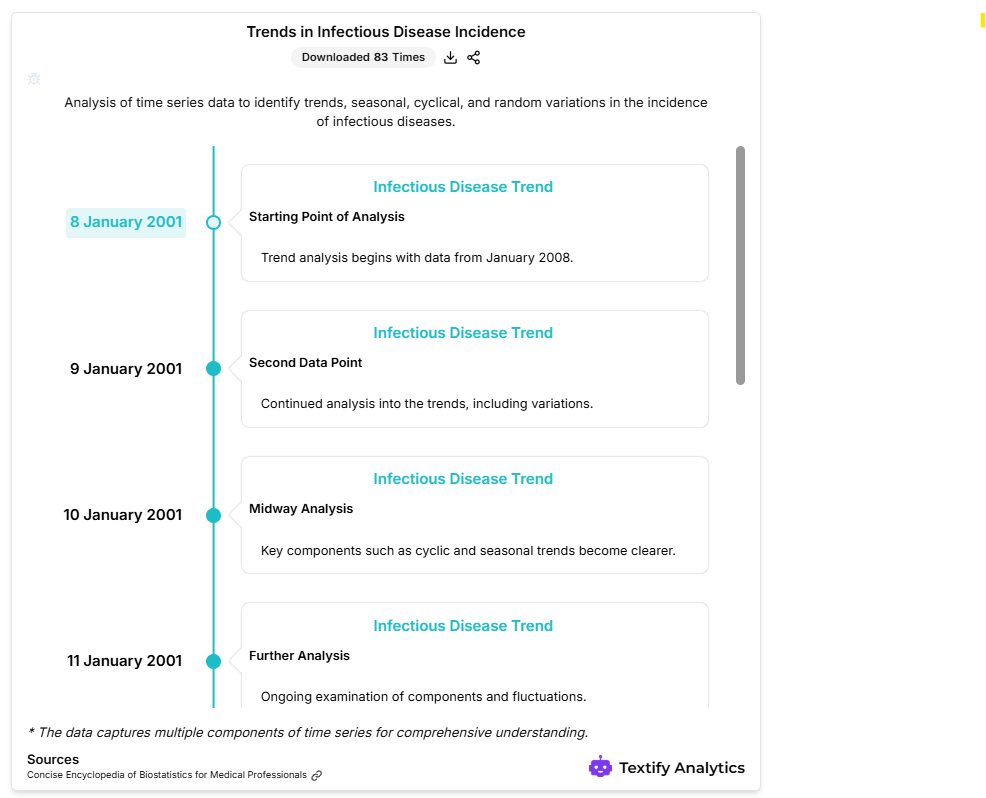
For instance, when analysing global vaccination rates, I quickly found historical trends, demographic data, and policy effectiveness charts, which formed the foundation of my presentation.
Step 2: Generating Relevant Charts with One Click
Data visualization is essential in public health presentations to make complex information easier to understand. Manually creating graphs and pie charts can be tedious and prone to errors.
How Textify Analytics Helped:
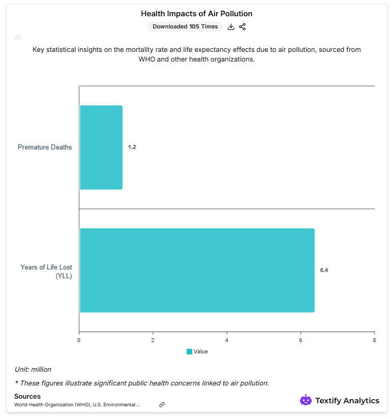
- Automatically generated charts for key metrics like disease prevalence, mortality rates, and public health expenditures.
- Offered various chart formats (bar graphs, line charts, heatmaps) to present data in the most effective way.
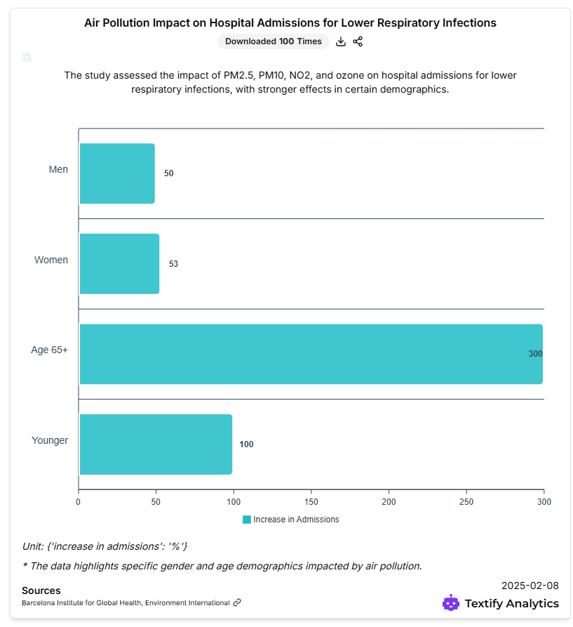
For example, when showcasing the impact of air pollution on respiratory diseases, I used a comparative bar chart that highlighted the correlation between pollution levels and hospital admissions.
Step 3: Conducting Comparative Public Health Analysis
A well-rounded public health study often involves comparisons between different regions, policies, or health interventions.
How Textify Analytics Helped:
- Enabled me to compare health data across multiple countries to understand global trends.
- Provided historical tracking to assess the long-term impact of policies such as smoking bans or vaccination campaigns.
For instance, I analyzed how COVID-19 response strategies varied across countries, using side-by-side comparison charts to illustrate the effectiveness of different measures.
Step 4: Structuring My Presentation for Maximum Impact
Once I had my charts and insights ready, the next step was to structure my PowerPoint or PDF presentation in a logical and engaging way.
How Textify Analytics Helped:
- Instantly generates charts, bar graphs, scatter plots from data.
- Allowed me to export charts directly into my presentation without formatting issues.
For example, my final presentation included:
- Introduction: Overview of key public health challenges.
- Data Insights: Charts on disease trends, healthcare costs, and health policy impacts.
- Comparative Analysis: Effectiveness of various health interventions.
- Conclusions & Recommendations: Data-supported policy suggestions.
Step 5: Presenting and Sharing the Findings
After completing my presentation, I needed to share and discuss the findings with stakeholders, researchers, and policymakers.
How Textify Analytics Helped:
- Allowed downloading and sharing the charts for easy distribution.
- Provided collaborative tools for feedback and refinement.
Final Thoughts
Textify Analytics transformed the way I built my Public Health Studies presentation. By providing instant access to relevant data, automated chart generation, and AI-powered insights, it saved me countless hours of manual research and enhanced the credibility of my presentation.
Whether you’re a student, researcher, or public health professional, Textify Analytics is an essential tool for making data-driven decisions and delivering impactful presentations.
Explore Textify Analytics today at https://analytics.textify.ai/ and elevate your public health research with powerful data insights!
Explore Textify’s AI membership
Be updated with Textify News
Need a Chart? Explore the world’s largest Charts database