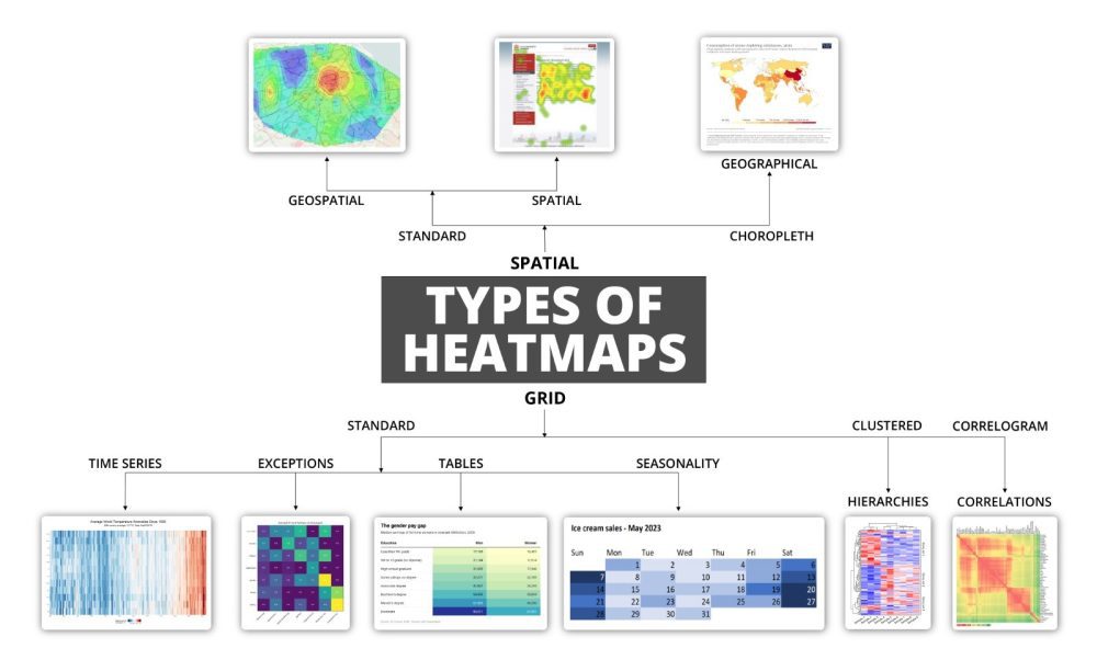
Heat maps are a powerful tool in the arsenal of data scientists and analysts. They provide a graphical representation of data where individual values in a matrix are represented as colors. This method of data visualization is particularly useful when dealing with large datasets, as it allows for quick identification of patterns, correlations, and anomalies.
Uses Across Different Fields
Heat maps are widely used across various fields, including statistics, mathematics, and programming, particularly in the realm of data science. They offer a visual way to analyze complex datasets, making it easier to understand and interpret the information. The use of color coding in heat maps helps in distinguishing between different values, making it easier to spot trends and outliers.
In the context of data science, it can be used for various purposes, such as identifying correlations between variables, visualizing missing data, and analyzing the distribution of values. For instance, in the field of bioinformatics, heat maps help display gene expression data, where different colors represent varying levels of gene expression. Similarly, in finance, they help to visualize stock market data, where different colors represent different levels of stock performance.
Creating Heat Maps in R Programming
Creating a heat map in R programming is a straightforward process. R is a powerful statistical programming language that provides various packages and functions for creating heat maps. One such package is ‘ggplot2’, which is widely used for data visualization in R. The ‘ggplot2’ package provides a function called ‘geom_tile()’, which can be used to create heat maps. This function takes a data frame as input and creates a heat map based on the values in the data frame.
Step-by-Step Guide
To create a heat map in R, you first need to install and load the ‘ggplot2’ package. You can do this by running the following commands in R:
rCopy codeinstall.packages('ggplot2')
library(ggplot2)
Once the package is installed and loaded, you can create a heat map using the ‘geom_tile()’ function. Here is an example of how to create a heat map in R:
rCopy codedata <- matrix(rnorm(100), nrow=10)
heatmap(data, Rowv=NA, Colv=NA, col=heat.colors(256), scale='column')
This code creates a heat map of a 10×10 matrix of random numbers. The ‘heatmap()’ function uses several arguments, including the data, the color scheme, and the scaling method. In this example, the ‘heat.colors()’ function generates a color scheme, and the ‘scale’ argument is ‘column’ to scale the values by column.
The Role of Heat Maps in Data-Driven Decision-Making
Heat maps are not only useful for visualizing data but also for making data-driven decisions. By providing a clear and concise visual representation of data, heat maps can help businesses and organizations identify trends, patterns, and anomalies that may not be immediately apparent from raw data. This can lead to more informed decision-making and better outcomes.
For example, in the field of urban planning, it helps visualize the distribution of heat in different areas of a city. This can help city planners identify areas that are more prone to heat stress and implement measures to mitigate the effects of heat. Similarly, in healthcare, it helps visualize the distribution of diseases in different regions, helping healthcare providers allocate resources more effectively.
Conclusion: The Power and Versatility of Heat Maps
In conclusion, heat maps are a versatile and powerful tool for data visualization. They provide a clear and concise way to represent complex datasets, making it easier to identify patterns, correlations, and anomalies. Whether you are a data scientist, a business analyst, or a researcher, heat maps can help you make sense of your data and make more informed decisions.
For more information on how to create it in R programming, you can visit this link.
Ready to Transform Your Hotel Experience? Schedule a free demo today
Explore Textify’s AI membership
Explore latest trends with NewsGenie
