
When putting together your business emails, you probably pay close attention to things like your subject line and your call to action and, while these things are important, they don’t mean much without a great design. In this article, we’re sharing X email design examples to inspire your next campaign.
The anatomy of an email design
A fantastic email design is one which immediately pulls you in and draws your eye to the key content. Email design is a practiced art and is made up of a number of factors which we’ll explore in this section:
Colour

As with any other kind of design, colour matters when it comes to your business emails. For us humans, different colours have different associations such as:
- Black – While black can look a little stark, it is associated with sophistication, elegance and mystery.
- White – Purity and innocence are words that go hand in hand with white.
- Red – We tend to connect red to a sense of urgency or danger.
- Blue – The colour of water, blue instills a sense of calm and reassurance.
- Green – As with blue, green is associated with tranquility but also freshness and nature.
- Yellow – The sunniest colour of the rainbow, we link yellow to joy, happiness and creativity.
- Purple – Bold and luxurious, we think of purple in terms of royalty, wealth and exclusivity.
- Pink – Feminine and playful, pink is also linked to sweetness, kindness and love.
- Brown – The colour of earth, brown is associated with reliability, stability and organicness.
As you can see, colour can very much emphasise and underline your messaging when it comes to your emails when used intelligently.
Font

A font is just a font, right ? Wrong. When it comes to designing an inspirational email, your font matters just as much as anything else.
Your email font is pretty much the foundation of your email and sets the tone for the content and, as such, attention must be paid. The best fonts for business emails are:
Before we look at specific fonts, your first job is to figure out what kind of tone you want your email to set – for example:
- Professional
- Formal
- Friendly
- Fun
- Quirky
Once you’ve settled on your tone, it’s time to look at different fonts. The single, most important thing here is that your font must be one which is easy to read quickly. Most people have little patience and if they have to decipher your font they will, in all likelihood, simply cast your email into the great internet bin in the sky.
Good fonts for business emails

Serif is easy to read and features short tails at the end of the letters which automatically draw the eye onto the next letter, word and line.
Times New Roman is a classic font which is super easy to read.
Arial is a fairly blocky font which allows for quick and easy scanning.
Georgia is another font which is easy on the eye and allows for quick reading but is also a little more elegant than others.
Bad fonts for business emails
Pacifico is an elegant font which looks a little bit like fancy handwriting. While this might seem like a good thing, it’s not. Just like with handwriting, this type of font can be hard to read which will often frustrate the reader and send them onto the next email – which may just be from one of your competitors.

Similarly, Lobster is a fishy font which will probably result only in your reader reaching boiling point.

Just as bad are quirky fonts like Comic Sans. While these might be useful in highlighting a header or particular point, steer clear of these for the body of your email as they give the impression that you’re not taking your content – or your business – seriously.

Email design examples

At the beginning of this article, we promised you some email design examples and, here they are:
Good email design examples
Grubhub
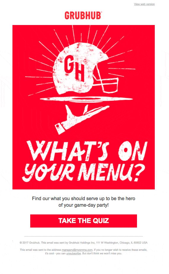
Food delivery is booming and fiercely competitive. Grubhub excels in using color to stand out (red can instill a sense of urgency). Their dynamic graphics ensure they grab attention. For a deeper dive into how Grubhub and others stay ahead, check out this competitor analysis article. In this cutthroat market, it’s essential to understand the competition, and this article will give you the insights you need to stay ahead. If you’re overwhelmed by email clutter and looking for a way to simplify your inbox, you might also want to explore how to mass unsubscribe from emails in Gmail for a cleaner, more organized experience.
This one also cleverly uses a question and the option of a quiz to keep the reader engaged, making it a fantastic example of a winning email design.
Uber
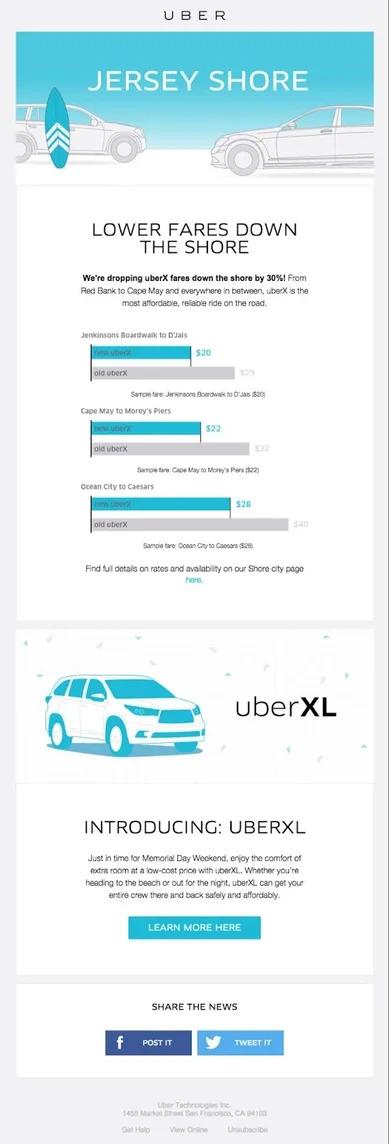
Taxi app Uber has been around the block a few times when it comes to putting together cracking emails and this one is no exception. Using uber-personalisation, the company also uses classic blue, white and black text with a clear font for great readability.
This email also nails its messaging by clearly setting out the salient information – i.e. how much money you can save!
J Crew
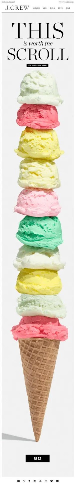
We would expect nothing less than perfection from J Crew and this one doesn’t disappoint. Using pastel colours and We would expect nothing less than perfection from J Crew and ice cream – the symbol of summer – this advert ticks a lot of boxes. In addition to the colours and font, the bottom of the ice cream cone serves as an arrow pointing to the call to action. Sweet, simple and effective.
Casper
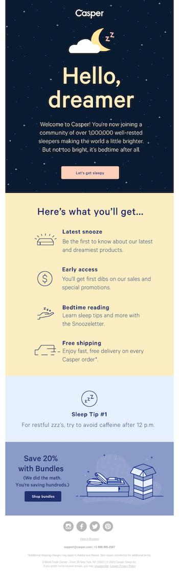
With its colour double whammy, Casper manages the sophistication of black alongside the friendliness of yellow. Using different colour themes for different sections of the email is a fantastic way of drawing attention to each while keeping the email flowing.
Bad email design examples
As we’ve given a shout out to the great email designs out there, it’s only right that we mention a few that don’t quite hit the mark:
Foodtown
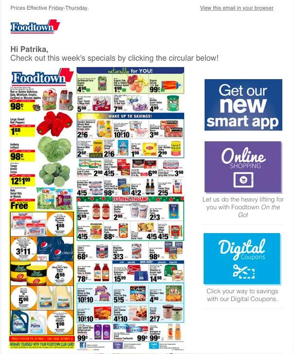
So, where to start with this one ? How about the imagery? There is simply waaaaaay too much going on here – throwing tons of information and images at the reader means that they will just go into brain freeze and choose to look at none of it.
Also, the language and font make the email look, quite frankly, cheap – as though somebody’s kid has knocked it up as a school project.
Finally, instead of one clear call to action, Foodtown has chosen to litter the email with clickbait meaning that the reader is left confused and, it has to be said, unimpressed.
Macy’s
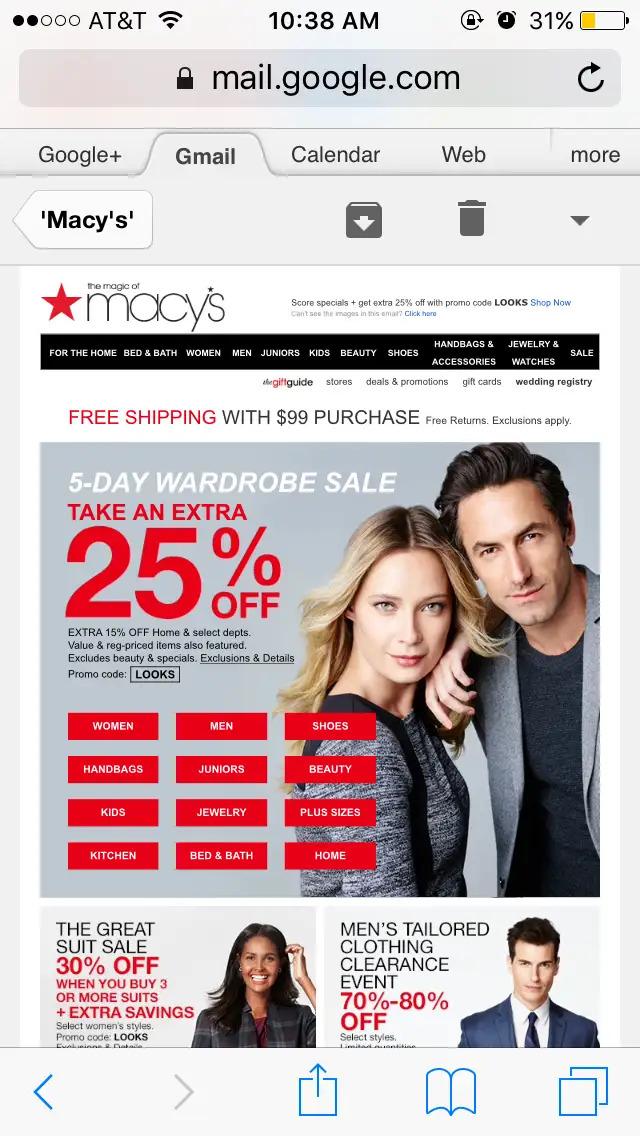
Macy’s is, of course, a big hitter and their fashion email marketing campaigns (above) looks fine, right ? Now imagine this email on your phone instead of on a laptop screen – pretty busy right – not to mention tricky to hit those teeny tiny buttons.
While Macy’s gets quite a lot right, they consistently fail to adapt to the fact that most of their customers are now reading their emails on their phones – which means that the emails fail to convert.
Levene’s Solicitors
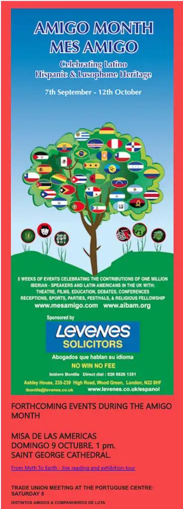
OK so, to begin with, this looks a bit like a still from a children’s television program. Secondly, it has zero personalisation and, instead, tries to encapsulate everybody (and fails). At first (and second and third) glance, you wouldn’t identify this as an email from a law firm and, also, the messaging is simply way too busy.
Finally, the blurred text is not inviting or easy to read and is likely to induce a migraine.
Email design Dos and Don’ts

Putting together a great business email is an art – and one which takes practice and, so, in this section, we’re sharing some things that you should do – and some things that you should definitely avoid !
The Do’s
Use colour – appropriately
If you were paying attention, you’ll remember that, at the beginning of this article, we waxed lyrical about the use of colour in your emails. Using colour in your emails involves treading a fine line – too much and it’ll look like a kid’s drawing; too little and it will look stark and uninviting. Make sure that you pick the right colour for your messaging – i.e, as we’ve said, decide on the tone of your email and then use colour in an appropriate way to back this up.
Get the ratio right

In order to be effective, your email needs to contain the right balance of text and images. While you want to use enough text to inform the reader of what you’re all about, he or she doesn’t want to plough through pages of text. Keep your text short and concise and balanced with great images.
Nail the call to action
It’s all very well making sure that your email is interesting to read with the right font, the right colour and the right balance of text and images – but ‘it’ll mean nothing if your reader doesn’t know what you want or expect them to do next.
A clear and visible call to action is essential for sealing the deal and getting your reader to progress to the next stage, whether that’s making a phone call or visiting your website.
Personalise, personalise, personalise
We can’t emphasise this one too much. In this day and age, generic messaging simply won’t cut it. There’s really no excuse for not personalising as there are lots of free and cheap tools out there which can help you to do just that. Personalising your emails is, quite literally the key to your success – we promise you it’ll be worth it.
The Don’ts

There are a few things that you absolutely positively should not do when designing your business email and some of these are:
Overpacking your email
If you have lots of products or services to offer, you may be tempted to cram as many of them into your email as you can. Don’t. When creating an email, you need to try to focus the reader’s mind – which means keeping it simple, to the point and pleasing to the eye.
Overpacking your email simply causes confusion and will very rarely result in any type of engagement from the recipient.
Inappropriate language / images

When your email is coming from a company which professes to be professional, this should be reflected in the content. This means avoiding language which is too casual or informal and, also, in the name of all that’s holy, always avoid emojis which are really only relevant to a teenage audience.
Bragging

This is a rookie mistake that a lot of SMEs make when first starting out with email marketing. OK, we get that you might have some fantastic qualifications or that you might have worked with some awesome companies but you need to be careful if you choose to use this information in your marketing as it can come across as bragging.
If you must use this, keep it subtle – for example, “During a recent project with Tesla, we discovered that X can really help companies like yours”. See what we did there? This allows you to blow your own trumpet without coming across as a braggart.
A job worth doing right

Email marketing is all about showcasing what you’ve got to offer and making it appealing to the recipient. For this reason, your marketing emails should never just be thrown together during your lunch break.
Take the time to think about your ideal customer and what their pain points / wishes might be. You can then begin to build your email around this.
Your ideal email format should go like this:
- Brief introduction
- Identify the pain points
- Solve the pain points
- Wrap it up with a killer call to action
In this article, we’ve shown you some examples of companies who have got it right – and some who have got it really really wrong. While it’s not rocket science, email marketing is an art which is based on empathy while using great communication skills.

Finally, don’t forget to properly test your emails to find out what works for you and what doesn’t as this will help you to build a great template for your emails going forward.
Email is still one of the most effective marketing methods out there so it’s worth taking the time to get it right.
Check out more AI tool.
Elevate Guest Experience with RoomGenie
🚀 Check out NewsGenie – Your AI consultant